
Dunkin' Donuts Has a New Look
Just recently I wrote about a new collaboration between Dunkin' Donuts and Harpoon Beer for what is perhaps the first ever coffee beer. Beer x coffee.
Well this new coffee beer isn't the only thing going on at this particular retail coffee giant. Dunkin' Donuts has a new look and feel in the making, and it's looking pretty fun and very familiar.
While the brand is sticking to its infamous logo and color scheme, it's dialing up the energy and bringing new life to its packaging.
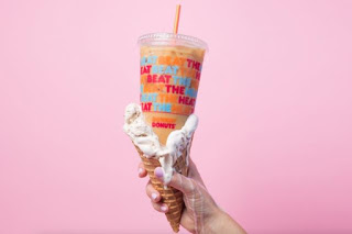
Like the iced coffee:
And the donut sticks:
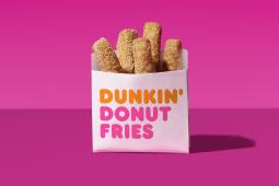
It's familiar because it totally leverages the logo and colors we've grown to expect from Dunkin' Donuts but brings a lightness and flair that we haven't necessarily seen before from the brand.
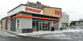
Dunkin' Donuts is also experimenting with a new concept store (first one near hometown Boston) that is lighter and brighter and more user friendly with a mobile order drive-thru.
Smart. Hallmark of a great brand...continual reinvention, even if it's subtle and incremental. Constant improvement contributes to ongoing brand loyalty. And keeps it fresh, just like the donuts.
Well done! What's your experience? JIM.